Henri Matisse painting Bathers by a River, May 13, 1913. Photograph by Alvin Langdon Coburn. Courtesy of George Eastman House, International Museum of Photography and Film, Rochester
Well, I made it to Matisse, Radical Invention, 1913-1917. The artist’s pass turned out to be useful as well as economical; it allowed me entry even though all the timed admissions for the day had been issued. Usually, I find the titles of big shows to be a little hyperbolic, but this one was apt. These paintings made me see Matisse in a way I had not seen him before, which is not a platitude or inert, as I had not only seen many of the paintings already, but I have been looking at Matisse pretty close up ever since I began looking at paintings, in college. At that time, I lived near the Baltimore Museum of Art, which was home to the Cone Collection, the amazing array of paintings amassed by the two sisters from Baltimore, who were patrons of Matisse and others artists in Paris. They almost gave the collection to another institution, thinking that "Hey hon’!" City didn’t deserve it. I’m glad as hell they didn’t as it was a major part of my visual education.
The work Matisse did in the time period covered by this exhibition was always puzzling to me. For some reason, I could never read the paintings well or understand their motivations and their excellence. Sometimes they looked like an obligatory foray into cubism, other times they just felt torpid. This has changed. The paintings combined gritty, intensely worked surfaces, willful unconcern for finish, and of course remarkable color. Maybe you just don't see things until you are ready, or maybe the collection of these pieces is a credit to the focus of the curators. Or both. The show just knocked me flat.
The images below are taken from the catalogue (Matisse, Radical Invention 1913-1917, Yale University Press, 2010). The color reproduction is extremely accurate in the catalogue. That is somewhat unusual. I have come out of many big exhibitions at big museums, looked at the catalogue and been severely disappointed. It must be very difficult to do well. We recently picked up a good digital camera. Shots of recent paintings of mine are astoundingly accurate on the computer display. That's the easy part, apparently. The process of getting images from a computer onto a page is clearly an art in itself, so kudos to the brilliant folks who pulled it off here. And the price is extremely reasonable. You know you want one.
Click on the images for larger resolutions.
The Blue Nude always hung in a prominent place in the Cone Collection. I probably saw 30 times over the course of the years I was in Baltimore, maybe more. The painting is much rougher and powerfully unkempt than I recalled. There is a shadow of the right arm hardly bothered with. A yellow splotch on the shoulder, a blue-grey blob indicating the inside of the upper arm, and so on. The color has a kind of sick timbre, and the whole painting exudes a disjointedness and ardent, get-it-done vigor without the expressive self-consciousness sometimes associated with that mode of painting. Fantastic, fantastic painting. I think I spent half an hour in front of it in total.
The black center background in Goldfish with Palette is an immense vacuum. The black is painted right around the objects. It is spatially adventurous, in the manner of cubism, but is segmented on a larger scale. The painting is divided into blocks and angular chunks of space, not microfolds. The dry brushwork and striations from the palette knife become a structural component of the color, and create a sense of contingency.
Piano Lesson is a big painting, hugely sophisticated. The green triangle is so bold, but also reads as light—late afternoon light to me—despite its seemingly impenetrable opacity.
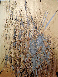
As historical artifacts, I can’t remember seeing any paintings from this period or any period before this that were so raw and deliberately unpolished. They must have made a mark on his contemporaries. They certainly made an impression on me, almost 100 years later. And with work like this:
Ian McLeod, Untitled #31, 19.5" x 16.75" (irregular), acrylic, latex, tape, sticker and varathane on cardboard (2010?). More here.
...and this:
View of Joe Bradley's studio. Photo: Jack Siegel. These paintings are on display at Gavin Brown's Enterprise in New York until 19 February 2011. See also here for James Kalm's video.
...and this:
Cheryl Donegan, Luxury Dust (Gold), 2007, gold tape on cardboard, 24 × 18 inches. Donegan's work is also included in the Jewel Thief exhibition, up through 27 February 2011 at the Tang Museum in Saratoga Springs.
...being made these days, I find surprising affinities.
“Sometimes I hear [the monks] say, ‘I didn’t become a monk to practice the Dharma! I ordained to study.’ These are the words of someone who has completely cut off the path of practice. It’s a dead end.”
—Ajahn Chah


3 comments:
Wow! Thanks for the tour through the tour. I loved spending time with the Matisses at the Baltimore Museum of Art. The Cone Collection was my favorite part of the museum. I like your reading of Blue Nude. It truly is a painting to linger by.
Thanks, glad you liked it. The Cone Collection was a great resource. I think the total time I spent in front of the Cezanne "Bibemus Quarry" painting would amount to days. Days well spent!
Great post, Chris!
Post a Comment